We are here to talk about Kadence Blocks DOM Size and will Kadence Blocks slow down your website.
Gutenberg Blocks are awesome because they are lightweight? Well, not all Gutenberg Blocks are made equal, and the same goes for Kadence Blocks. We will be discovering the DOM Size for each and every Gutenberg Blocks by the Kadence Blocks Plugin.
DOM or document object model is an audit in the Google Page Speed insights. I’m pretty sure you have seen this before:

But if you haven’t, you are lucky.
So, what exactly is DOM, and how do they affect your page speed?
If you want to watch me in action, feel free to do so:
What is Document Object Model (DOM)?
Simply speaking, every single element you use on your page, be it a paragraph, a container, advanced columns, a link, an image, a button, or whatever, adds to the DOM.
But, here are some elements that constructs DOM:
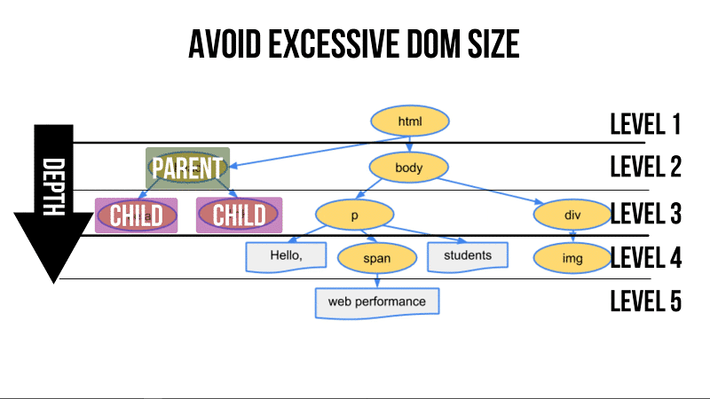
- Nodes: Every element, such as an image, a link, a button, a paragraph, by itself are called Nodes.
- DOM Depth: The distance between each node and the root element is known as the depth.
- Child Nodes: Elements below each parent node are called child nodes.
Here’s an image that will help solidify your understanding.
Google Page Speed Insights will flag your page with the “Avoid Excessive DOM Size” if your web page have:
- More than 1,500 nodes in total
- A DOM Depth of greater than 32 nodes
- 60 child nodes or more under one parent node
Now that we know what DOM is, do you know every Kadence Block will add a different number to the DOM Size?
Let’s start with the DOM Size of a blank page, so that we have a based data for comparison.
| DOM | Blank Page |
|---|---|
| Total DOM Elements | 140 |
| Max. DOM Depth | 19 |
| Max. Child Elements | 9 |
How It Is Tested?
Based on the data provided by the blank page, we are going to add one block at a time to the blank page and run a Google Page Speed Insights Test.
The focus is on the audit called “Avoids an excessive DOM Size”, and we will record the changes of the DOM when each Gutenberg Block is added.
We will run a test on the default settings of each block, and then we will switch things up by adjusting every possible settings in the block to see if we can find the Maximum DOM elements each Gutenberg block can add to the blank page.
Take note that these tests are not meant to be definitive, but more of a guide for you to avoid or be aware of the pitfalls of adding or adjusting each Gutenberg Block from the Kadence Blocks.
Blocks that will NOT be tested (due to uncontrollable variables):
- Table of Contents Block
- Posts Block
So now, let’s start with the “Spacer/Divider” Block…
Spacer / Divider Block
The following shows the number of DOM elements added to a blank page:
| Block | DOM Elements Added | Max. DOM Depth | Max. Child Elements |
|---|---|---|---|
| Default Settings | +4 | 0 | 0 |
| Adjusted | +9 | 0 | 0 |
Conclusion: The Spacer / Divider Block is a lightweight Gutenberg Block. It adds only 4 DOM elements by default, and when I’ve adjusted all the settings in the block, the maximum DOM elements added is only 9.
Advanced Button Block

| Block | DOM Elements Added | Max. DOM Depth | Max. Child Elements |
|---|---|---|---|
| Default Settings | +5 | 0 | 0 |
| Adjusted | +12 | 0 | +2 |
Addition of Buttons

| Block | DOM Elements Added | Max. DOM Depth | Max. Child Elements |
|---|---|---|---|
| Button x 2 | +20 | 0 | +2 |
| Button x 3 | +28 | 0 | +2 |
Conclusion: By default the Advanced Button Block is lightweight. But, as you make more adjustments, such as adding animations to the button, it will add more DOM elements and increases the Child Elements.
Also, every additional button you add, it will increase the DOM elements by 8.
Icon Block

| Block | DOM Elements Added | Max. DOM Depth | Max. Child Elements |
|---|---|---|---|
| Default Settings | +12 | 0 | 0 |
| Adjusted | +12 | 0 | 0 |
Addition of Icons

| Block | DOM Elements Added | Max. DOM Depth | Max. Child Elements |
|---|---|---|---|
| Icon x 2 | +22 | 0 | 0 |
| Icon x 3 | +32 | 0 | 0 |
Conclusion: The Icon Block is considered a lightweight Gutenberg Block. By default it adds 12 DOM elements, and no matter how I adjusted the settings of the block, the DOM elements did not change.
Further to that, every new icon added to the block will add 10 DOM elements.
Advanced Heading Block

| Block | DOM Elements Added | Max. DOM Depth | Max. Child Elements |
|---|---|---|---|
| Default Settings | +2 | 0 | 0 |
| Adjusted | +5 | 0 | +2 |
Conclusion: In general, the default Advanced Heading Block is super lightweight, which is great! We don’t want our header to add lots of DOM elements to the page. However, as we adjusted the settings, the block becomes a little heavier. It adds 2 to the child elements.
Just beware that if you make adjustments to the block, make sure it doesn’t add to the child elements, because remember Google PSI flags this audit if a parent node has more than 60 child nodes?
What if you have 30 headings and sub-headings on your page that adds 2 child elements each, your page will immediately be flagged with the “Avoids an excessive DOM Size” audit.
Tabs Block

| Block | DOM Elements Added | Max. DOM Depth | Max. Child Elements |
|---|---|---|---|
| Default Settings (3 Tabs) | +24 | 0 | +1 |
| Adjusted | +39 | 0 | +1 |
| 4 Tabs | +49 | 0 | +1 |
Testing Different Layouts

| Block | DOM Elements Added | Max. DOM Depth | Max. Child Elements |
|---|---|---|---|
| Layout 2 | +24 | 0 | +1 |
| Layout 3 | +24 | 0 | +1 |
| Layout 4 | +33 | 0 | +1 |
Conclusion: The minimum DOM Elements of the Tab block is 24 (based on one text block added to each of the 3 tabs – 1 text block equals 1 DOM Element).
The maximum DOM Elements for the Tab Block is 39, and every new tab added, it will increase the DOM Elements by 10.
Overall, the tab block is a medium weight Gutenberg Block, and Layout 4 turns out to be the heaviest out of the 4 layouts.
Info Box Block

| Block | DOM Elements Added | Max. DOM Depth | Max. Child Elements |
|---|---|---|---|
| Default Settings | +19 | 0 | 0 |
| Adjusted | +21 | 0 | 0 |
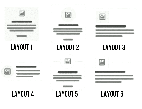
Testing Different Layouts
| Block | DOM Elements Added | Max. DOM Depth | Max. Child Elements |
|---|---|---|---|
| Layout 2 | +21 | 0 | 0 |
| Layout 3 | +21 | 0 | 0 |
| Layout 4 | +21 | 0 | 0 |
| Layout 5 | +21 | 0 | 0 |
| Layout 6 | +21 | 0 | 0 |
Conclusion: The Info Box is a medium-weight Gutenberg Block by default, but the advantage of using this block is that no matter the adjustments, it will only add 2 elements.
Also, there is no difference in DOM Size regardless of the layout you choose.
Accordion Block

| Block | DOM Elements Added | Max. DOM Depth | Max. Child Elements |
|---|---|---|---|
| Default Settings (2 Accordion) | +23 | 0 | +1 |
| Adjusted | +23 | 0 | +1 |
| Accordion x 3 | +32 | 0 | +1 |
Conclusion: Another medium-weight Gutenberg Block that adds 23 DOM elements. But, between using the Tabs Block and the Accordion Block to display content, I would prefer the Accordion Block, because it injects lesser DOM elements to the page.
Icon List Block

| Block | DOM Elements Added | Max. DOM Depth | Max. Child Elements |
|---|---|---|---|
| Icon List x 1 | +9 | 0 | 0 |
| Icon List x 2 | +15 | 0 | 0 |
| Icon List x 3 | +21 | 0 | 0 |
| Icon List x 4 | +27 | 0 | 0 |
| Icon List x 5 | +33 | 0 | 0 |
Conclusion: The Icon List Block is considered a light weight Gutenberg Block. By default it adds 9 DOM Elements, but every item added to the list will add an increment of 6 DOM elements.
Testimonial Block

| Block | DOM Elements Added | Max. DOM Depth | Max. Child Elements |
|---|---|---|---|
| Default Settings (Grid x 1) | +19 | 0 | 0 |
| Adjusted | +39 | 0 | 0 |
| Grid x 3 | +111 | 0 | 0 |
| Carousel x 3 | +276 | +3 | +2 |
There are two types of Testimonial displays:
- Grid
- Carousel
The Testimonial Block, by default, is a medium-sized Gutenberg Block, and the more you adjust, the heavier it gets.
By adding just 2 more Testimonial items to the Grid, it adds a total of 111 DOM Elements to the page. And, switching the Testimonial display to Carousel, you will see the number of DOM elements increased drastically, with the addition of DOM Depth and Child Elements.
Conclusion: If you can, try to avoid using the Testimonial block. Use the Info Box Block instead. However, if you really want to use the Testimonial block, then choose the display your content with Grid, rather than carousel.
Advanced Gallery Block

For this test, I have added 2 identical same sized images (see image below) to the block:
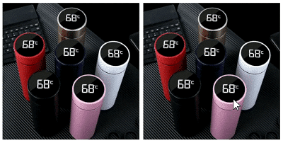
And here’s the result:
| Block | DOM Elements Added | Max. DOM Depth | Max. Child Elements |
|---|---|---|---|
| Default Settings (Image x 1) | +12 | 0 | +3 |
| Image x 2 (Same Size) | +18 | 0 | +3 |
Testing Block with Different Image Sizes
So, I have removed one of the images and replaced it an image with a different size. Here’s how it looks:
| Block | DOM Elements Added | Max. DOM Depth | Max. Child Elements |
|---|---|---|---|
| Image x 2 (Different Size) | +18 | 0 | +3 |
| Image x 3 Different Size) | +24 | 0 | +3 |
Conclusion: The Advanced Gallery Block is a lightweight Gutenberg Block by default, but it can easily bloat up the page when you have too many images added to the block.
Every image you add will increase the DOM Elements by 6. The Image size has no impact on the DOM Size.
Form Block

| Block | DOM Elements Added | Max. DOM Depth | Max. Child Elements |
|---|---|---|---|
| Default Settings | +23 | 0 | +2 |
| Removal of the Text Field | +19 | 0 | 0 |
| Adjusted | +26 | 0 | +6 |
While adjusting the settings of the Form Block, I’ve turned on every possible settings, and to be honest, I think it is over the top.
We certainly do not need to use every feature or autoresponder from this block. Every feature that is turned on, a code will be injected into the block, and inherently, it increases the DOM Size of the page.
Conclusion: Better than using a page builder to create a lead capture page, because it will bloat up the page. The Form Block is a great alternative to a fast loading lead capture page.
The maximum DOM Size for the Form Block is only 26, and I am pretty sure when you remove all the unnecessary features, it will be somewhere around 22 DOM Elements.
Countdown Block

| Block | DOM Elements Added | Max. DOM Depth | Max. Child Elements |
|---|---|---|---|
| Default Settings | +17 | 0 | +2 |
| Adjusted | +30 | 0 | +2 |
Conclusion: The Countdown Block is a medium-sized Gutenberg Block by default, and the maximum DOM Size for this block is 30. In general, I don’t think you will use more than 1 Countdown Timer on your page, so it is safe to use.
Row Layout Block
| Block | DOM Elements Added | Max. DOM Depth | Max. Child Elements |
|---|---|---|---|
| One Column + One Paragraph | +7 | 0 | 0 |
| Two Columns + Two Paragraphs | +10 | 0 | 0 |
| Three Columns + Three Paragraphs | +13 | 0 | 0 |
| Adjusted (One Column + One Paragraph) | +14 | 0 | +2 |
Nested Row Layout
Basically, a nested Row Layout will look like the image below. It is one Row Layout2 stacked on top of another Row Layout1:

| Block | DOM Elements Added | Max. DOM Depth | Max. Child Elements |
|---|---|---|---|
| Adjusted Row Layout stacked on top of Another Row Layout | +14 | +2 | +2 |
Conclusion: When possible, try not to nest row layouts especially for pages or posts that do not require lots of design elements, such as a blog post or any articles that are competing for ranking on Google.
Because, the more you Row Layout you stack on top of each other, the more DOM Elements it add, and that affects the performance of your site.
Image Overlay Block (Pro)

| Block | DOM Elements Added | Max. DOM Depth | Max. Child Elements |
|---|---|---|---|
| Default Settings (D) | +11 | 0 | 0 |
| D + 1 Image | +12 | 0 | 0 |
| Adjusted | +15 | 0 | +2 |
| Adjusted (w/o Animation) | +13 | 0 | 0 |
Conclusion: The image overlay is generally a lightweight block, but if you want to use it on an “Image Heavy” page, which means a page that has lots of images, then you may want to avoid adding animations to it.
Split Content Block (Pro)
| Block | DOM Elements Added | Max. DOM Depth | Max. Child Elements |
|---|---|---|---|
| Default Settings (D) (1 Image + 1 Title + 1 Paragraph) | +10 | 0 | 0 |
| Adjusted | +12 | 0 | +2 |
| Adjusted (w/o Animation) | +10 | 0 | 0 |
Conclusion: Split content is an awesome way for you to create sections like this:

With this block, you no longer need to play around with the padding and margin of the Row Layout to achieve this. It is easily created with Split Content.
Plus, this is a lightweight block by default, so Feel free to use it as you will.
Post Grid/Carousel Block (Pro)
| Block | DOM Elements Added | Max. DOM Depth | Max. Child Elements |
|---|---|---|---|
| Default (Grid – 6 posts) | +146 | +1 | 0 |
| Default (Masonry – 6 posts) | +155 | +2 | +3 |
| Default (Carousel – 6 posts) | +346 | +4 | +6 |
Conclusion: By default, the “Post Grid/Carousel” Block is a heavy Gutenberg Block. As you can see, it adds a lot of Elements and it increases the DOM Depth and Child elements.
There are 4 layout options and 3 display formats. The most lightweight display format is the Grid, and the heaviest display format of all is the Carousel.
Carousels are known to slow down your webpage. So, if you can avoid using it, do so.
Generally, I would avoid using this block entirely (if possible).
Modal Block (Pro)
| Block | DOM Elements Added | Max. DOM Depth | Max. Child Elements |
|---|---|---|---|
| Default | +13 | 0 | +1 |
| Adjusted | +13 | 0 | +1 |
Conclusion: Personally, I love using this block because it can make my page look professional. For example, the default Modal Block comes with a button and when clicked on, it will trigger a popup where your content will show.
This is the simplest form of the Modal Block. You can even hide the button of this block and use it as a trigger. You can add the trigger to Gutenberg Blocks, like the Advanced Button or the Info Box, so when clicked on, the Modal Block will be displayed.
As I said, this is a very useful Block.
Innately, all the settings have already been set, so whatever changes you make will not add much to the DOM Elements.
However, the final DOM size of this Block depends on what you add to the content area. Even though the Modal Block is lightweight, if you add heavy elements in the content area, for example, a video embed, it will still cause your site to slow down.
So, use this Gutenberg Block with caution.
Video Popup Block (Pro)

| Block | DOM Elements Added | Max. DOM Depth | Max. Child Elements |
|---|---|---|---|
| Default A (No Elements Added) | +11 | 0 | +2 |
| Default B (YouTube Video Added) | +11 | 0 | +2 |
| Default C (YouTube Video + Thumbnail Image) | +12 | 0 | +2 |
| Adjusted (with Animation & Shadow) + Default C | +14 | 0 | +4 |
| Adjusted (with NO Animation & Shadow) + Default C | +12 | 0 | +2 |
Conclusion: The Video Popup block is a great alternative to the default YouTube Video Embed provided by the innate WordPress Editor. Using the default video embed, it could easily cause your site to slow down, and you may even get a 30+ rating on Google Pagespeed Insights.
With Video Popup, although you will not get a 90+ rating on Google Pagespeed Insights, you will get a high 80s rating.
By default, the Video Popup Block by Kadence Blocks will not slow down your website, but a video from external source, such as YouTube, will. The Video Popup helps to reduce that impact.
Advanced Slider Block (Pro)
| Block | DOM Elements Added | Max. DOM Depth | Max. Child Elements |
|---|---|---|---|
| Experiment A (See below) | +25 | +2 | +2 |
| Experiment B (See below) | +28 | +2 | +2 |
| Experiment C (See below) | +36 | +2 | +2 |
Experiment A
In this experiment, I’ve only added a Text Block to the Slider. By default, 2 sliders are added to the Block, and it looks like this:

Experiment B
Continuing from Experiment A, I’ve added 2 Images, added an overlay on both images, and styled the text. Now, it looks like this:

Experiment C
From Experiment B, we have added another Slider Element and have styled it like we did in Experiment B.

Conclusion: More Slider items means more DOM Elements added to the page. For this case, it is 8 elements (change from Experiment B to C).
By default, the Slider Block is a Heavy Gutenberg Block because of the javascript codes added to make the carousel work. But, it is not as heavy as the “Post Grid/Carousel”.
The Post Grid/Carousel Block is heavy because it draws information from the internal database to be displayed on screen, but the Slider block does not.
Portfolio Grid/Carousel Block (Pro)

| Block | DOM Elements Added | Max. DOM Depth | Max. Child Elements |
|---|---|---|---|
| Default (Grid – 6 posts) | +75 | 0 | 0 |
| Default (Masonry – 6 posts) | +85 | 0 | +3 |
| Default (Carousel – 6 posts) | +192 | +2 | +5 |
| Default (Fluid Carousel – 6 posts) | +205 | +2 | +7 |
Conclusion: As I’ve said, whenever there is carousel, and it is drawing information from the database, it will add a lot to the DOM Size. I’ll try to avoid using this block when possible.
Will Kadence Blocks Slow Down Your Website?
To generalize why certain Kadence Blocks slow down the page, they are blocks that:
- Draws information from the site’s database (i.e. Post Grid/Carousel Block);
- Draws information from a third party source (i.e. YouTube Embeds);
- Has the carousel display option;
- Needs JavaScript to work (i.e. Tabs);
- Uses animation
These are the main reasons why a supposedly fast Gutenberg Block will slow down a website.
Let me summarize for you which Gutenberg Blocks by Kadence Blocks are lightweight and which are not:
| Block | Weight | DOM Size (Default Settings) |
|---|---|---|
| Advanced Heading | Lightweight | +2 |
| Spacer / Divider | Lightweight | +4 |
| Advanced Button | Lightweight | +5 |
| Row Layout | Lightweight | +7 |
| Icon List | Lightweight | +9 |
| Split Content (Pro) | Lightweight | +10 |
| Video Popup (Pro) | Lightweight | +11 |
| Image Overlay (Pro) | Lightweight | +11 |
| Advanced Gallery | Lightweight | +12 |
| Icon | Lightweight | +12 |
| Modal (Pro) | Lightweight | +13 |
| Countdown | Medium-weight | +17 |
| Testimonial | Medium-weight | +19 |
| Info Box | Medium-weight | +19 |
| Accordion | Medium-weight | +23 |
| Form | Medium-weight | +23 |
| Tabs | Medium-weight | +24 |
| Advanced Slider (Pro) | Heavy | +25 |
| Portfolio Grid / Carousel (Pro) | Heavy | +75 |
| Post Grid / Carousel (Pro) | Heavy | +146 |
Thank you for checking out this article! I hope it has provided value to you.
Your friend,
Jack


Very helpful, Jack, Thanks!
You are welcome, Ken! Happy to help!
This article is comprehensive! I used these metrix to improve the performance of my site. As a blogger I understand the amount of time it took to put something like this together. Thanks for all of the hard work and time.
Interesting article! That’s the main problem still today with wordpress. No one really does an analysis on how something can have an impact on their website in general. I have learned that myself along the way to figuring out what really works the best and what doesn’t. Most just like to put things together without testing their sites performance on all devices and not just desktops. They just throw something together and say it’s done.
Amazing job man! This article is awesome, we’re also trying to make better websites for our clients, and this is something i was looking for